Default
<div class="comet-button-group" role="group">
    <button class="comet-button comet-button--secondary">
        Objectives
    </button>
    <button class="comet-button comet-button--secondary">
        Questions
    </button>
    <button class="comet-button comet-button--secondary">
        Remediation
    </button>
</div>
{% call comet.button_group() %}
            {{ comet.button(class="comet-button--secondary", text="Objectives") }}
            {{ comet.button(class="comet-button--secondary", text="Questions") }}
            {{ comet.button(class="comet-button--secondary", text="Remediation") }}
        {% endcall %}

Macro params reference
Exclusive Selection
Use radio button input elements as buttons to create a mutually exclusive toggle.
<div class="comet-button-group" role="group">
    <input id="comet-button-id--17543" type="radio" class="comet-button__input" name="button-groups-sink-1" checked />
    <label class="comet-button comet-button--secondary comet-button--toggle" role="button" for="comet-button-id--17543">
        Coach
    </label>
    <input id="comet-button-id--70600" type="radio" class="comet-button__input" name="button-groups-sink-1" />
    <label class="comet-button comet-button--secondary comet-button--toggle" role="button" for="comet-button-id--70600">
        Play
    </label>
    <input id="comet-button-id--84275" type="radio" class="comet-button__input" name="button-groups-sink-1" />
    <label class="comet-button comet-button--secondary comet-button--toggle" role="button" for="comet-button-id--84275">
        Cheer
    </label>
</div>
{% call comet.button_group() %}
{{ comet.button(class="comet-button--secondary", el="radio", name="button-groups-sink-1", text="Coach", checked=true) }}
{{ comet.button(class="comet-button--secondary", el="radio", name="button-groups-sink-1", text="Play") }}
{{ comet.button(class="comet-button--secondary", el="radio", name="button-groups-sink-1", text="Cheer") }}
{% endcall %}
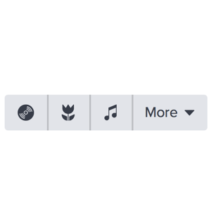
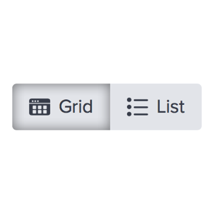
Macro params referenceExclusive Selection button groups can be used as layout toggles.
 Figure: Grid/List Toggle Example
Independent Selections
Use checkbox input elements as buttons to create a button group with multiple toggles.
<div class="comet-button-group" role="group">
    <input id="comet-button-id--6382" type="checkbox" class="comet-button__input" checked />
    <label class="comet-button comet-button--secondary comet-button--toggle" role="button" for="comet-button-id--6382">
        <strong>B</strong>
    </label>
    <input id="comet-button-id--12516" type="checkbox" class="comet-button__input" />
    <label class="comet-button comet-button--secondary comet-button--toggle" role="button" for="comet-button-id--12516">
        <em>I</em>
    </label>
    <input id="comet-button-id--6091" type="checkbox" class="comet-button__input" checked />
    <label class="comet-button comet-button--secondary comet-button--toggle" role="button" for="comet-button-id--6091">
        <span style='text-decoration: underline'>U</span>
    </label>
</div>
{% call comet.button_group() %}
                    {{ comet.button(class="comet-button--secondary", el="checkbox", checked="true", text="<strong>B</strong>") }}
                    {{ comet.button(class="comet-button--secondary", el="checkbox", text="<em>I</em>") }}
                    {{ comet.button(class="comet-button--secondary", el="checkbox", checked="true", text="<span style='text-decoration: underline'>U</span>") }}
                {% endcall %}

Macro params reference
More
Use a dropdown button within a button group to incorporate additional secondary actions that are contextually related to the other actions within the group.
<div class="comet-button-group" role="group">
    <button class="comet-button comet-button--secondary">
        Objectives
    </button>
    <button class="comet-button comet-button--secondary">
        Questions
    </button>
    <button class="comet-button comet-button--secondary">
        Remediation
    </button>
    <button class="comet-button comet-button--secondary comet-button--icon-xs comet-dropdown-trigger js-comet-dropdown-trigger comet-button--icon-with-text" data-comet-popover='button-group-dropdown-1'>
        <span class="comet-button__inner">
            <span class="comet-button__text">
                More
            </span>
            <svg class="comet-button__icon comet-button__icon--right" aria-hidden="true" focusable="false">
                <use xlink:href="/comet/comet_assets/comet.svg#triangle-down"></use>
            </svg>
        </span>
    </button>
</div>
<div class="comet-dropdown-menu comet-popover comet-popover--bottom-right-aligned" id="button-group-dropdown-1" data-comet-popover-align="right">
    <div class="comet-list-group comet-dropdown-menu__list-group comet-list-group--no-hairlines">
        <ul class="comet-list-group__list">
            <li class="comet-list-group__row">
                <a class="comet-list-group__row-anchor" href="">
                    <span class="comet-list-group__row-label">
                        Longer Option Here
                    </span>
                </a>
            </li>
            <li class="comet-list-group__row comet-dropdown-menu__item--separator-after">
                <a class="comet-list-group__row-anchor" href="">
                    <span class="comet-list-group__row-label">
                        Another Long Option
                    </span>
                </a>
            </li>
            <li class="comet-list-group__row">
                <a class="comet-list-group__row-anchor" href="">
                    <span class="comet-list-group__row-label">
                        Separate Option
                    </span>
                </a>
            </li>
        </ul>
    </div>
</div>
{% call comet.button_group() %}
                        {{ comet.button(class="comet-button--secondary", text="Objectives") }}
                        {{ comet.button(class="comet-button--secondary", text="Questions") }}
                        {{ comet.button(class="comet-button--secondary", text="Remediation") }}
                        {{ comet.button(
                                    class="comet-button--secondary comet-button--icon-xs comet-dropdown-trigger js-comet-dropdown-trigger",
                                    text="More",
                                    icon_right="triangle-down",
                                    attrs="data-comet-popover='button-group-dropdown-1'") }}
                    {% endcall %}
                    {{ comet.dropdown_menu(
                                menu_alignment="right",
                                id="button-group-dropdown-1",
                                menu_items=[
                                    {
                                        label: "Longer Option Here"
                                    },
                                    {
                                        label: "Another Long Option",
                                        class: "comet-dropdown-menu__item--separator-after"
                                    },
                                    {
                                        label: "Separate Option"
                                    }
                                ]) }}

Macro params reference-
include “More” text in a button group.
-
use an icon-only button for the More menu trigger.
Style Modifiers
Vertical Group
Use a comet-button-group--vertical class to switch the orientation of the button group to vertical.
<div class="comet-button-group comet-button-group--vertical" role="group">
    <button class="comet-button comet-button--secondary comet-button--icon-only">
        <svg class="comet-button__icon comet-button__icon--left" aria-hidden="true" focusable="false">
            <use xlink:href="/comet/comet_assets/comet.svg#dashboard"></use>
        </svg>
        <span class="comet-screenreader-only">false</span>
    </button>
    <button class="comet-button comet-button--secondary comet-button--icon-only">
        <svg class="comet-button__icon comet-button__icon--left" aria-hidden="true" focusable="false">
            <use xlink:href="/comet/comet_assets/comet.svg#asset-book"></use>
        </svg>
        <span class="comet-screenreader-only">false</span>
    </button>
    <button class="comet-button comet-button--secondary comet-button--disabled comet-button--icon-only">
        <svg class="comet-button__icon comet-button__icon--left" aria-hidden="true" focusable="false">
            <use xlink:href="/comet/comet_assets/comet.svg#whiteboard"></use>
        </svg>
        <span class="comet-screenreader-only">false</span>
    </button>
    <button class="comet-button comet-button--secondary comet-button--icon-only">
        <svg class="comet-button__icon comet-button__icon--left" aria-hidden="true" focusable="false">
            <use xlink:href="/comet/comet_assets/comet.svg#graphing"></use>
        </svg>
        <span class="comet-screenreader-only">false</span>
    </button>
</div>
{% call comet.button_group(class="comet-button-group--vertical") %}
{{ comet.button(class="comet-button--secondary", icon_name="dashboard") }}
{{ comet.button(class="comet-button--secondary", icon_name="asset-book") }}
{{ comet.button(class="comet-button--secondary comet-button--disabled", icon_name="whiteboard") }}
{{ comet.button(class="comet-button--secondary", icon_name="graphing") }}
{% endcall %}
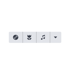
Macro params referenceUse a vertical group when anchoring a group of buttons to the side of a viewport. An example of a vertical group is the “tool tray,” which is anchored to the bottom right side of the Techbook window.
 Figure: Vertical Group Example
Small Button Group
Use a comet-button--small modifier class on the buttons within the button group to create a small button group
<div class="comet-button-group" role="group">
    <button class="comet-button comet-button--secondary comet-button--small">
        Objectives
    </button>
    <button class="comet-button comet-button--secondary comet-button--small">
        Questions
    </button>
    <button class="comet-button comet-button--secondary comet-button--small">
        Remediation
    </button>
</div>
{% call comet.button_group() %}
                        {{ comet.button(class="comet-button--secondary comet-button--small", text="Objectives") }}
                        {{ comet.button(class="comet-button--secondary comet-button--small", text="Questions") }}
                        {{ comet.button(class="comet-button--secondary comet-button--small", text="Remediation") }}
                    {% endcall %}

Macro params reference
Wide Button Group
Use a comet-button--wide modifier class on the buttons within the button group to create wider icon buttons.
<div class="comet-button-group" role="group">
    <button class="comet-button comet-button--secondary comet-button--wide comet-button--icon-only">
        <svg class="comet-button__icon comet-button__icon--left" aria-hidden="true" focusable="false">
            <use xlink:href="/comet/comet_assets/comet.svg#print"></use>
        </svg>
        <span class="comet-screenreader-only">false</span>
    </button>
    <button class="comet-button comet-button--secondary comet-button--wide comet-button--icon-only">
        <svg class="comet-button__icon comet-button__icon--left" aria-hidden="true" focusable="false">
            <use xlink:href="/comet/comet_assets/comet.svg#copy"></use>
        </svg>
        <span class="comet-screenreader-only">false</span>
    </button>
    <button class="comet-button comet-button--secondary comet-button--wide comet-button--icon-only">
        <svg class="comet-button__icon comet-button__icon--left" aria-hidden="true" focusable="false">
            <use xlink:href="/comet/comet_assets/comet.svg#download"></use>
        </svg>
        <span class="comet-screenreader-only">false</span>
    </button>
</div>
{% call comet.button_group() %}
                        {{ comet.button(class="comet-button--secondary comet-button--wide", icon_name="print") }}
                        {{ comet.button(class="comet-button--secondary comet-button--wide", icon_name="copy") }}
                        {{ comet.button(class="comet-button--secondary comet-button--wide", icon_name="download") }}
                    {% endcall %}

Macro params reference-
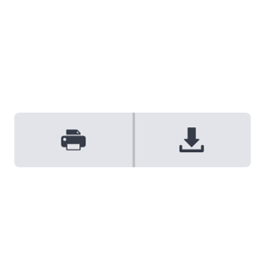
Use the wide button modifier class when additional width is needed for icon buttons.
-
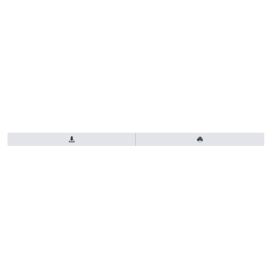
Stretch a button group to fill the viewport or container.
Guidelines
-
Use button groups for filtering or changing the layout of content within a page.
-
Use button groups for navigation to different content. Use tabs instead.
-
Use the same button group sizes in a common toolbar.
-
Use different button group sizes in a common toolbar.
Accessibility
Include both role and aria-label attributes on the .comet-button-group element to ensure button groups are accessible by screen readers.
- Add an appropriate
roleto button group to assist screenreader users understand the component's purpose. Button groups userole="group"by default. If the button group is a navigation, addrole="navigation". Usearia-labelto define any custom role types. - For icon only button groups, add a
titleattribute to the button for screen reader users.
<div class="comet-button-group" role="radiogroup" aria-label="Layout Toggle">
    <input id="comet-button-id--59293" type="radio" class="comet-button__input" name="button-groups-sink-4" checked />
    <label class="comet-button comet-button--secondary comet-button--toggle comet-button--icon-with-text" role="button" for="comet-button-id--59293">
        <span class="comet-button__inner">
            <svg class="comet-button__icon comet-button__icon--left" aria-hidden="true" focusable="false">
                <use xlink:href="/comet/comet_assets/comet.svg#dashboard"></use>
            </svg>
            <span class="comet-button__text">
                Grid
            </span>
        </span>
    </label>
    <input id="comet-button-id--25071" type="radio" class="comet-button__input" name="button-groups-sink-4" />
    <label class="comet-button comet-button--secondary comet-button--toggle comet-button--icon-with-text" role="button" for="comet-button-id--25071">
        <span class="comet-button__inner">
            <svg class="comet-button__icon comet-button__icon--left" aria-hidden="true" focusable="false">
                <use xlink:href="/comet/comet_assets/comet.svg#asset-review-sheet"></use>
            </svg>
            <span class="comet-button__text">
                List
            </span>
        </span>
    </label>
</div>
{% call comet.button_group(role="radiogroup", aria_label="Layout Toggle") %}
                        {{ comet.button(class="comet-button--secondary", el="radio", name="button-groups-sink-4", text="Grid", icon_name="dashboard", checked=true) }}
                        {{ comet.button(class="comet-button--secondary", el="radio", name="button-groups-sink-4", text="List", icon_name="asset-review-sheet") }}
                    {% endcall %}

Macro params reference
Class Reference
| Class | Applies to | Outcome |
|---|---|---|
|
|
A containing element with nested buttons |
Creates a button group |
|
|
|
Creates vertical stacking buttons within a button group. |
Macro Params Reference
The button group macro is a wrapper around any number of button components. Use the nunjucks {% call %} method to use the button group.
{% call comet.button_group() %}
    {{ comet.button(text="My first button") }}
    {{ comet.button(text="My second button") }}
{% endcall %}
| Param | Default | Values | Description |
|---|---|---|---|
|
class |
false |
String |
Space separated classes that will be applied to the button group |
|
role |
false |
String |
Sets the |
|
aria-label |
false |
String |
Sets the |