Cards are a well-suited and convenient way to display an object using a variety of related elements. You can showcase diverse content types – asset, person, assignment, and more – together in a card grid such as search results, assignments, or resources to explore.
Default

<li class="comet-card">
    <a href="asset-page.html" class="comet-card__card-anchor">
        <!-- Image / Icon -->
        <div class="comet-thumbnail">
            <div class="comet-thumbnail__inner" style="background-image: url('/images/components/thumbnail/video-set2-1.jpg')">
                <img src="/images/components/thumbnail/video-set2-1.jpg" alt="" class="comet-thumbnail__print-only-image">
            </div>
        </div>
        <!-- Copy -->
        <div class="comet-card__copy">
            <span class="comet-card__type">Video</span>
            <p class="comet-card__title">LIFE: Fish</p>
            <p class="comet-card__duration comet-pill--overlay">43:34</p>
        </div>
    </a>
    <!-- List Group -->
    <!-- Actions (icons, buttons) -->
    <!-- for later release -->
</li>
{{ comet.card(
    {
        img_url: "/images/components/thumbnail/video-set2-1.jpg",
        href: "asset-page.html",
        type: "Video",
        title: "LIFE: Fish",
        caption: false,
        duration: "43:34"
    }
)}}

Macro params reference
Light Theme
<li class="comet-card comet-card--light">
    <a href="asset-page.html" class="comet-card__card-anchor">
        <!-- Image / Icon -->
        <div class="comet-thumbnail">
            <div class="comet-thumbnail__inner" style="background-image: url('/images/components/thumbnail/video-set2-1.jpg')">
                <img src="/images/components/thumbnail/video-set2-1.jpg" alt="" class="comet-thumbnail__print-only-image">
            </div>
        </div>
        <!-- Copy -->
        <div class="comet-card__copy">
            <span class="comet-card__type">Video</span>
            <p class="comet-card__title">LIFE: Fish</p>
            <p class="comet-card__duration comet-pill--overlay">43:34</p>
        </div>
    </a>
    <!-- List Group -->
    <!-- Actions (icons, buttons) -->
    <!-- for later release -->
</li>
{{ comet.card(
    {
        img_url: "/images/components/thumbnail/video-set2-1.jpg",
        href: "asset-page.html",
        type: "Video",
        title: "LIFE: Fish",
        caption: false,
        theme: "light",
        duration: "43:34"
    }
)}}

Macro params reference
White Theme
<li class="comet-card comet-card--white">
    <a href="asset-page.html" class="comet-card__card-anchor">
        <!-- Image / Icon -->
        <div class="comet-thumbnail">
            <div class="comet-thumbnail__inner" style="background-image: url('/images/components/thumbnail/video-set2-1.jpg')">
                <img src="/images/components/thumbnail/video-set2-1.jpg" alt="" class="comet-thumbnail__print-only-image">
            </div>
        </div>
        <!-- Copy -->
        <div class="comet-card__copy">
            <span class="comet-card__type">Video</span>
            <p class="comet-card__title">LIFE: Fish</p>
            <p class="comet-card__duration comet-pill--overlay">43:34</p>
        </div>
    </a>
    <!-- List Group -->
    <!-- Actions (icons, buttons) -->
    <!-- for later release -->
</li>
{{ comet.card(
    {
        img_url: "/images/components/thumbnail/video-set2-1.jpg",
        href: "asset-page.html",
        type: "Video",
        title: "LIFE: Fish",
        caption: false,
        theme: "white",
        duration: "43:34"
    }
)}}

Macro params reference
Varying Image Aspect Ratio

<li class="comet-card">
<a href="asset-page.html" class="comet-card__card-anchor">
<!-- Image / Icon -->
<div class="comet-thumbnail comet-thumbnail--contain">
<div class="comet-thumbnail__inner" style="background-image: url('/images/components/thumbnail/search-clinton.jpg')">
<img src="/images/components/thumbnail/search-clinton.jpg" alt="" class="comet-thumbnail__print-only-image">
</div>
</div>
<!-- Copy -->
<div class="comet-card__copy">
<span class="comet-card__type">Video</span>
<p class="comet-card__title">Bill Clinton</p>
</div>
</a>
<!-- List Group -->
<!-- Actions (icons, buttons) -->
<!-- for later release -->
</li>
<li class="comet-card">
<a href="asset-page.html" class="comet-card__card-anchor">
<!-- Image / Icon -->
<div class="comet-thumbnail comet-thumbnail--contain">
<div class="comet-thumbnail__inner" style="background-image: url('/images/components/thumbnail/search-enrollment.jpg')">
<img src="/images/components/thumbnail/search-enrollment.jpg" alt="" class="comet-thumbnail__print-only-image">
</div>
</div>
<!-- Copy -->
<div class="comet-card__copy">
<span class="comet-card__type">Video</span>
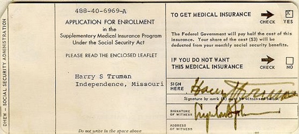
<p class="comet-card__title">An Application Document</p>
</div>
</a>
<!-- List Group -->
<!-- Actions (icons, buttons) -->
<!-- for later release -->
</li>
<li class="comet-card">
<a href="asset-page.html" class="comet-card__card-anchor">
<!-- Image / Icon -->
<div class="comet-thumbnail comet-thumbnail--contain">
<div class="comet-thumbnail__inner" style="background-image: url('/images/components/thumbnail/search-eternal-flame.jpg')">
<img src="/images/components/thumbnail/search-eternal-flame.jpg" alt="" class="comet-thumbnail__print-only-image">
</div>
</div>
<!-- Copy -->
<div class="comet-card__copy">
<span class="comet-card__type">Video</span>
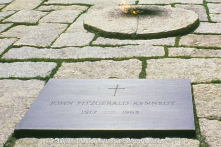
<p class="comet-card__title">A Memorial</p>
</div>
</a>
<!-- List Group -->
<!-- Actions (icons, buttons) -->
<!-- for later release -->
</li>
{{ comet.card(
    {
        img_url: "/images/components/thumbnail/search-clinton.jpg",
        thumbnail_contain: true,
        href: "asset-page.html",
        type: "Video",
        title: "Bill Clinton"
    }
) }}
{{ comet.card(
    {
        img_url: "/images/components/thumbnail/search-enrollment.jpg",
        thumbnail_contain: true,
        href: "asset-page.html",
        type: "Video",
        title: "An Application Document"
    }
) }}
{{ comet.card(
    {
        img_url: "/images/components/thumbnail/search-eternal-flame.jpg",
        thumbnail_contain: true,
        href: "asset-page.html",
        type: "Video",
        title: "A Memorial"
    }
) }}

Macro params reference
Contain an entire image in its block when image aspect ratio is uncertain, such as search results, using features of the Thumbnail component that the card includes.
With Associated Assets
<li class="comet-card">
    <a href="asset-page.html" class="comet-card__card-anchor">
        <!-- Image / Icon -->
        <div class="comet-thumbnail">
            <div class="comet-thumbnail__inner" style="background-image: url('/images/components/thumbnail/video-set2-1.jpg')">
                <img src="/images/components/thumbnail/video-set2-1.jpg" alt="" class="comet-thumbnail__print-only-image">
            </div>
        </div>
        <!-- Copy -->
        <div class="comet-card__copy">
            <span class="comet-card__type">Video</span>
            <p class="comet-card__title">LIFE: Fish</p>
            <p class="comet-card__duration comet-pill--overlay">43:34</p>
        </div>
    </a>
    <!-- List Group -->
    <div class="comet-list-group comet-theme--dark-background">
        <ul class="comet-list-group__list">
            <li class="comet-list-group__row">
                <a class="comet-list-group__row-anchor" href="">
                    <svg class="comet-list-group__row-type-icon" aria-hidden="true" focusable="false">
                        <use xlink:href="/comet/comet_assets/comet.svg#document-pdf"></use>
                    </svg>
                    <span class="comet-list-group__row-label">
                        Teachers Guide
                    </span>
                </a>
            </li>
            <li class="comet-list-group__row">
                <a class="comet-list-group__row-anchor" href="">
                    <svg class="comet-list-group__row-type-icon" aria-hidden="true" focusable="false">
                        <use xlink:href="/comet/comet_assets/comet.svg#document-pdf"></use>
                    </svg>
                    <span class="comet-list-group__row-label">
                        Student Course Guide
                    </span>
                </a>
            </li>
        </ul>
    </div>
    <!-- Actions (icons, buttons) -->
    <!-- for later release -->
</li>
{{ comet.card(
    {
        img_url: "/images/components/thumbnail/video-set2-1.jpg",
        type: "Video",
        title: "LIFE: Fish",
        href: "asset-page.html",
        caption: false,
        duration: "43:34",
        list_group_items: [
            {
                label: "Teachers Guide",
                type_icon: "document-pdf"
            },
            {
                label: "Student Course Guide",
                type_icon: "document-pdf"
            }
        ]
    }
) }}

Macro params reference
Include at most 5 associated assets, such as related documents, within the card under the copy area via the List Group component that the card includes.
Without Image
<li class="comet-card">
    <a href="" class="comet-card__card-anchor">
        <!-- Image / Icon -->
        <div class="comet-thumbnail comet-thumbnail--no-image">
            <div class="comet-thumbnail__inner">
                <svg class="comet-thumbnail__icon" aria-hidden="true" focusable="false">
                    <use xlink:href="/comet/comet_assets/comet.svg#asset-audio-cd"></use>
                </svg>
            </div>
        </div>
        <!-- Copy -->
        <div class="comet-card__copy">
            <span class="comet-card__type">Audio CD</span>
            <p class="comet-card__title">[CD Title]</p>
        </div>
    </a>
    <!-- List Group -->
    <!-- Actions (icons, buttons) -->
    <!-- for later release -->
</li>
{{ comet.card(
        item =
            {
                type: "Audio CD",
                title: "[CD Title]",
                asset_type: "audio-cd"
            }
) }}

Macro params reference
Display an asset type icon when an image is unavailable using a feature of the Thumbnail component that the card includes.
Squared

<div class="comet-card comet-theme--dark-background ">
    <a href="" class="comet-card__card-anchor">
        <!-- Image / Icon -->
        <div class="comet-thumbnail  comet-thumbnail--squared">
            <div class="comet-thumbnail__inner" style="background-image: url('/images/components/thumbnail/concept-1.jpeg')">
                <img src="/images/components/thumbnail/concept-1.jpeg" alt="" class="comet-thumbnail__print-only-image">
            </div>
        </div>
        <!-- Copy -->
        <div class="comet-card__copy">
            <span class="comet-card__type">Project</span>
            <p class="comet-card__title">Digging</p>
            <p class="comet-card__caption">Rock in a small portion of the tunnel has too many fault lines to safely use the TBM. Crews must use liquid explosives to remove the rock from this section...</p>
        </div>
    </a>
    <!-- List Group -->
    <!-- Actions (icons, buttons) -->
    <!-- for later release -->
</div>
{{
                    comet.card(
                        item = {
                            img_url: "/images/components/thumbnail/concept-1.jpeg",
                            class: "comet-theme--dark-background ",
                            thumbnail_square: true,
                            type: "Project",
                            title: "Digging",
                            caption: "Rock in a small portion of the tunnel has too many fault lines to safely use the TBM. Crews must use liquid explosives to remove the rock from this section..."
                        },
                        element_type = "div",
                        class = ""
                    )
                }}

Macro params reference
Display a Card’s thumbnail as --square to draw a distinctive emphasis to a limited number (3-5) cards, such as a STEM projects progression of assignments.
- Avoid a squared Card display for a grid of more than 6 cards in one display, preferring a more compact display of many cards.
Cards in a Grid Layout
While cards can be stacked independently one-by-one, most are arranged in a grid.
To arrange cards in a grid format and maintain consistent card heights in each row, wrap the cards in a .comet-cards element and include three trailing comet-card--invisible elements. These additional .comet-card--invisible elements also ensure cards in a grid remain left aligned even when there are not enough cards to “fill” the last row in the grid. If using the cards macro, these elements are added automatically.
To view cards arranged in a grid in a more realistic setting not contained in the example viewer's block below, visit the Card examples page.

<ul class="comet-cards">
    <li class="comet-card">
        <a href="" class="comet-card__card-anchor">
            <!-- Image / Icon -->
            <div class="comet-thumbnail">
                <div class="comet-thumbnail__inner" style="background-image: url('/images/components/thumbnail/video-set2-1.jpg')">
                    <img src="/images/components/thumbnail/video-set2-1.jpg" alt="" class="comet-thumbnail__print-only-image">
                </div>
            </div>
            <!-- Copy -->
            <div class="comet-card__copy">
                <span class="comet-card__type">Video</span>
                <p class="comet-card__title">LIFE: Fish</p>
                <p class="comet-card__duration comet-pill--overlay">43:34</p>
            </div>
        </a>
        <!-- List Group -->
        <!-- Actions (icons, buttons) -->
        <!-- for later release -->
    </li>
    <li class="comet-card">
        <a href="" class="comet-card__card-anchor">
            <!-- Image / Icon -->
            <div class="comet-thumbnail">
                <div class="comet-thumbnail__inner" style="background-image: url('/images/components/thumbnail/video-set2-2.jpg')">
                    <img src="/images/components/thumbnail/video-set2-2.jpg" alt="" class="comet-thumbnail__print-only-image">
                </div>
            </div>
            <!-- Copy -->
            <div class="comet-card__copy">
                <span class="comet-card__type">Video</span>
                <p class="comet-card__title">Junior Zoologist: Fish, Amphibeans, and Reptiles</p>
                <p class="comet-card__duration comet-pill--overlay">16:06</p>
            </div>
        </a>
        <!-- List Group -->
        <!-- Actions (icons, buttons) -->
        <!-- for later release -->
    </li>
    <li class="comet-card">
        <a href="" class="comet-card__card-anchor">
            <!-- Image / Icon -->
            <div class="comet-thumbnail">
                <div class="comet-thumbnail__inner" style="background-image: url('/images/components/thumbnail/video-set2-3.jpg')">
                    <img src="/images/components/thumbnail/video-set2-3.jpg" alt="" class="comet-thumbnail__print-only-image">
                </div>
            </div>
            <!-- Copy -->
            <div class="comet-card__copy">
                <span class="comet-card__type">Video</span>
                <p class="comet-card__title">Life Science: Reptiles</p>
                <p class="comet-card__duration comet-pill--overlay">20:00</p>
            </div>
        </a>
        <!-- List Group -->
        <!-- Actions (icons, buttons) -->
        <!-- for later release -->
    </li>
    <li class="comet-card comet-card--invisible"></li>
    <li class="comet-card comet-card--invisible"></li>
    <li class="comet-card comet-card--invisible"></li>
</ul>
{{ comet.cards(
                items = [
                    {
                        img_url: "/images/components/thumbnail/video-set2-1.jpg",
                        type: "Video",
                        title: "LIFE: Fish",
                        caption: false,
                        duration: "43:34"
                    },
                    {
                        img_url: "/images/components/thumbnail/video-set2-2.jpg",
                        type: "Video",
                        title: "Junior Zoologist: Fish, Amphibeans, and Reptiles",
                        caption: false,
                        duration: "16:06"
                    },
                    {
                        img_url: "/images/components/thumbnail/video-set2-3.jpg",
                        type: "Video",
                        title: "Life Science: Reptiles",
                        caption: false,
                        duration: "20:00"
                    }
                ]
            ) }}

Macro params reference
Avoid arranging cards with the (grid component)[/components/grid.html], which doesn't align the heights of cards in the same row.
Apply the
comet-cardsclass to either a containing<div class=”comet-cards”>or<ul class=”comet-cards”>.
Guidelines
Visual Style
- Arrange Cards in a responsive grid format, with 1 or 2 per row at the narrowest widths and 3 to 4 per row at the widest widths.
Editorial
- Always include a title and image or icon.
- Always overlay duration onto cards of videos.
- Optionally include caption and type (such as VIDEO).
-
include type (PROJECT) and caption (The introduction…) when available
-
include a title if no other descriptive content is available
-
omit a title, even if other content is available
-
use a card to show just an image. Instead, link a simpler thumbnail
Class Reference
| Class | Applies to | Outcome |
|---|---|---|
|
|
Parent of |
Wraps multiple cards into a list, displayed each in a grid using flexbox. |
|
|
|
Hides the trailing card(s) from being displayed, when used in conjunction with |
|
|
|
Changes card background color. |
|
|
|
Changes card background color. |
|
|
|
Changes card background color. |
Macro Reference
| Parameter | Values | Description |
|---|---|---|
|
items |
Array of |
Contains one or more |
|
item |
Object |
Object of varied properties, described below. |
|
element_type |
|
Defines the type of HTML element used, defaulting to a list item within an unordered list ( |
|
icon_path |
|
URL path to icon SVG file other than Comet’s, applying to all items. |
|
item.thumbnail_contain |
Boolean (default, |
If true, applies the |
|
item.thumbnail_square |
Boolean (default, |
If true, applies the |
|
item.class |
text |
Style modifiers (see Class Reference, above) and custom classes. |
|
item.href |
url |
URL path to card object location |
|
item.title |
text |
Card title |
|
item.asset_type |
icon-name |
Icon presented when an image is unavailable. |
|
item.img_url |
url |
URL path to card image location |
|
item.icon_path |
path |
URL path to icon SVG file other than Comet’s, applying to this item. |
|
item.type |
text |
Card type, displayed above title |
|
item.theme |
text |
Card theme, only used if light or white |
|
item.caption |
text |
Card caption, displayed under title |
|
item.duration |
text |
Card video duration, overlaid on thumbnail |
|
item.list_group_items |
List group items |
Refer to List Group documentation. |