Loading a Single Component
Avoid using a message when displaying a spinner within a single component such as a TEI or embedded video.
-
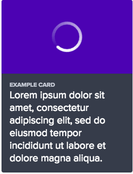
use a spinner icon, scaled proportionally to the size of the missing content.
-
use spinner messages within an individual component. Instead, rely on just the spinner.
Inline Message
Use a spinner inline message to illustrate additional rows of content loading, such as search results.
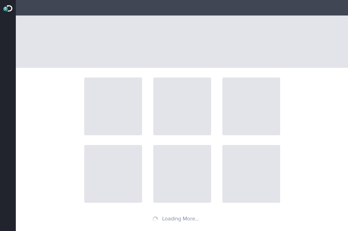
Small Inline Spinner
Loading More...
<div class="comet-spinner comet-spinner--small comet-spinner--on-light">
    <svg class="comet-spinner__icon" aria-labelledby="title" viewBox="-10 -10 220 220">
        <title>Loading More...</title>
        <defs>
            <linearGradient id="spinner-color-1" gradientUnits="objectBoundingBox" x1="0" y1="0" x2="1" y2="1">
                <stop offset="0%" stop-color="#7B869D" stop-opacity="0" />
                <stop offset="100%" stop-color="#7B869D" stop-opacity=".2" />
            </linearGradient>
            <linearGradient id="spinner-color-2" gradientUnits="objectBoundingBox" x1="0" y1="0" x2="0" y2="1">
                <stop offset="0%" stop-color="#7B869D" stop-opacity=".2" />
                <stop offset="100%" stop-color="#7B869D" stop-opacity=".4" />
            </linearGradient>
            <linearGradient id="spinner-color-3" gradientUnits="objectBoundingBox" x1="1" y1="0" x2="0" y2="1">
                <stop offset="0%" stop-color="#7B869D" stop-opacity=".4" />
                <stop offset="100%" stop-color="#7B869D" stop-opacity=".6" />
            </linearGradient>
            <linearGradient id="spinner-color-4" gradientUnits="objectBoundingBox" x1="1" y1="1" x2="0" y2="0">
                <stop offset="0%" stop-color="#7B869D" stop-opacity=".6" />
                <stop offset="100%" stop-color="#7B869D" stop-opacity=".8" />
            </linearGradient>
            <linearGradient id="spinner-color-5" gradientUnits="objectBoundingBox" x1="0" y1="1" x2="0" y2="0">
                <stop offset="0%" stop-color="#7B869D" stop-opacity=".8" />
                <stop offset="100%" stop-color="#7B869D" stop-opacity="1" />
            </linearGradient>
            <linearGradient id="spinner-color-6" gradientUnits="objectBoundingBox" x1="0" y1="1" x2="1" y2="0">
                <stop offset="0%" stop-color="#7B869D" stop-opacity="1" />
                <stop offset="100%" stop-color="#7B869D" stop-opacity="1" />
            </linearGradient>
        </defs>
        <circle fill="#7B869D" cx="45%" cy="0" r="7.5" />
        <g fill="none" stroke-width="20" transform="translate(100,100)">
            <path d="M 0,-100 A 100,100 0 0,1 86.6,-50" stroke="url(#spinner-color-1)" />
            <path d="M 86.6,-50 A 100,100 0 0,1 86.6,50" stroke="url(#spinner-color-2)" />
            <path d="M 86.6,50 A 100,100 0 0,1 0,100" stroke="url(#spinner-color-3)" />
            <path d="M 0,100 A 100,100 0 0,1 -86.6,50" stroke="url(#spinner-color-4)" />
            <path d="M -86.6,50 A 100,100 0 0,1 -86.6,-50" stroke="url(#spinner-color-5)" />
            <path d="M -86.6,-50 A 100,100 0 0,1 0,-100" stroke="url(#spinner-color-6)" />
        </g>
    </svg>
    <p class="comet-spinner__text comet-spinner__text--inline">Loading More...</p>
</div>
{{ comet.spinner(size = "small", content="Loading More...", content_type="inline") }}

Macro params reference
Only the small inline spinner is recommended. We retained the comet-spinner--small in order to match the naming convention in other variations.
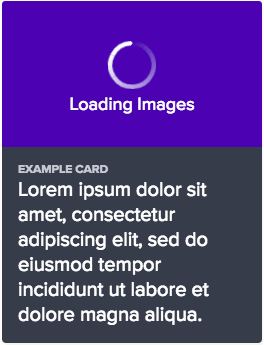
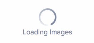
Stacked Message
Use a spinner stacked message to illustrate a large content area loading, such as a board or a classroom. Proportionally vary the scale of the spinner to fit the scale of the missing content.

Large Stacked Spinner
Loading Images
<div class="comet-spinner comet-spinner--large comet-spinner--on-light">
    <svg class="comet-spinner__icon" aria-labelledby="title" viewBox="-10 -10 220 220">
        <title>Loading Images</title>
        <defs>
            <linearGradient id="spinner-color-1" gradientUnits="objectBoundingBox" x1="0" y1="0" x2="1" y2="1">
                <stop offset="0%" stop-color="#7B869D" stop-opacity="0" />
                <stop offset="100%" stop-color="#7B869D" stop-opacity=".2" />
            </linearGradient>
            <linearGradient id="spinner-color-2" gradientUnits="objectBoundingBox" x1="0" y1="0" x2="0" y2="1">
                <stop offset="0%" stop-color="#7B869D" stop-opacity=".2" />
                <stop offset="100%" stop-color="#7B869D" stop-opacity=".4" />
            </linearGradient>
            <linearGradient id="spinner-color-3" gradientUnits="objectBoundingBox" x1="1" y1="0" x2="0" y2="1">
                <stop offset="0%" stop-color="#7B869D" stop-opacity=".4" />
                <stop offset="100%" stop-color="#7B869D" stop-opacity=".6" />
            </linearGradient>
            <linearGradient id="spinner-color-4" gradientUnits="objectBoundingBox" x1="1" y1="1" x2="0" y2="0">
                <stop offset="0%" stop-color="#7B869D" stop-opacity=".6" />
                <stop offset="100%" stop-color="#7B869D" stop-opacity=".8" />
            </linearGradient>
            <linearGradient id="spinner-color-5" gradientUnits="objectBoundingBox" x1="0" y1="1" x2="0" y2="0">
                <stop offset="0%" stop-color="#7B869D" stop-opacity=".8" />
                <stop offset="100%" stop-color="#7B869D" stop-opacity="1" />
            </linearGradient>
            <linearGradient id="spinner-color-6" gradientUnits="objectBoundingBox" x1="0" y1="1" x2="1" y2="0">
                <stop offset="0%" stop-color="#7B869D" stop-opacity="1" />
                <stop offset="100%" stop-color="#7B869D" stop-opacity="1" />
            </linearGradient>
        </defs>
        <circle fill="#7B869D" cx="45%" cy="0" r="7.5" />
        <g fill="none" stroke-width="20" transform="translate(100,100)">
            <path d="M 0,-100 A 100,100 0 0,1 86.6,-50" stroke="url(#spinner-color-1)" />
            <path d="M 86.6,-50 A 100,100 0 0,1 86.6,50" stroke="url(#spinner-color-2)" />
            <path d="M 86.6,50 A 100,100 0 0,1 0,100" stroke="url(#spinner-color-3)" />
            <path d="M 0,100 A 100,100 0 0,1 -86.6,50" stroke="url(#spinner-color-4)" />
            <path d="M -86.6,50 A 100,100 0 0,1 -86.6,-50" stroke="url(#spinner-color-5)" />
            <path d="M -86.6,-50 A 100,100 0 0,1 0,-100" stroke="url(#spinner-color-6)" />
        </g>
    </svg>
    <h3 class="comet-spinner__text">Loading Images</h3>
</div>
{{ comet.spinner(size = "large", content="Loading Images") }}
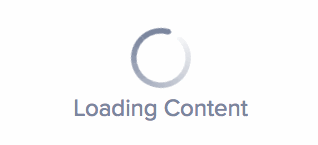
Macro params referenceMedium Stacked Spinner
Loading Images
<div class="comet-spinner comet-spinner--medium comet-spinner--on-light">
    <svg class="comet-spinner__icon" aria-labelledby="title" viewBox="-10 -10 220 220">
        <title>Loading Images</title>
        <defs>
            <linearGradient id="spinner-color-1" gradientUnits="objectBoundingBox" x1="0" y1="0" x2="1" y2="1">
                <stop offset="0%" stop-color="#7B869D" stop-opacity="0" />
                <stop offset="100%" stop-color="#7B869D" stop-opacity=".2" />
            </linearGradient>
            <linearGradient id="spinner-color-2" gradientUnits="objectBoundingBox" x1="0" y1="0" x2="0" y2="1">
                <stop offset="0%" stop-color="#7B869D" stop-opacity=".2" />
                <stop offset="100%" stop-color="#7B869D" stop-opacity=".4" />
            </linearGradient>
            <linearGradient id="spinner-color-3" gradientUnits="objectBoundingBox" x1="1" y1="0" x2="0" y2="1">
                <stop offset="0%" stop-color="#7B869D" stop-opacity=".4" />
                <stop offset="100%" stop-color="#7B869D" stop-opacity=".6" />
            </linearGradient>
            <linearGradient id="spinner-color-4" gradientUnits="objectBoundingBox" x1="1" y1="1" x2="0" y2="0">
                <stop offset="0%" stop-color="#7B869D" stop-opacity=".6" />
                <stop offset="100%" stop-color="#7B869D" stop-opacity=".8" />
            </linearGradient>
            <linearGradient id="spinner-color-5" gradientUnits="objectBoundingBox" x1="0" y1="1" x2="0" y2="0">
                <stop offset="0%" stop-color="#7B869D" stop-opacity=".8" />
                <stop offset="100%" stop-color="#7B869D" stop-opacity="1" />
            </linearGradient>
            <linearGradient id="spinner-color-6" gradientUnits="objectBoundingBox" x1="0" y1="1" x2="1" y2="0">
                <stop offset="0%" stop-color="#7B869D" stop-opacity="1" />
                <stop offset="100%" stop-color="#7B869D" stop-opacity="1" />
            </linearGradient>
        </defs>
        <circle fill="#7B869D" cx="45%" cy="0" r="7.5" />
        <g fill="none" stroke-width="20" transform="translate(100,100)">
            <path d="M 0,-100 A 100,100 0 0,1 86.6,-50" stroke="url(#spinner-color-1)" />
            <path d="M 86.6,-50 A 100,100 0 0,1 86.6,50" stroke="url(#spinner-color-2)" />
            <path d="M 86.6,50 A 100,100 0 0,1 0,100" stroke="url(#spinner-color-3)" />
            <path d="M 0,100 A 100,100 0 0,1 -86.6,50" stroke="url(#spinner-color-4)" />
            <path d="M -86.6,50 A 100,100 0 0,1 -86.6,-50" stroke="url(#spinner-color-5)" />
            <path d="M -86.6,-50 A 100,100 0 0,1 0,-100" stroke="url(#spinner-color-6)" />
        </g>
    </svg>
    <p class="comet-spinner__text">Loading Images</p>
</div>
{{ comet.spinner(size = "medium", content="Loading Images") }}

Macro params reference
###Small Stacked Spinner
Loading Images
<div class="comet-spinner comet-spinner--small comet-spinner--on-light">
    <svg class="comet-spinner__icon" aria-labelledby="title" viewBox="-10 -10 220 220">
        <title>Loading Images</title>
        <defs>
            <linearGradient id="spinner-color-1" gradientUnits="objectBoundingBox" x1="0" y1="0" x2="1" y2="1">
                <stop offset="0%" stop-color="#7B869D" stop-opacity="0" />
                <stop offset="100%" stop-color="#7B869D" stop-opacity=".2" />
            </linearGradient>
            <linearGradient id="spinner-color-2" gradientUnits="objectBoundingBox" x1="0" y1="0" x2="0" y2="1">
                <stop offset="0%" stop-color="#7B869D" stop-opacity=".2" />
                <stop offset="100%" stop-color="#7B869D" stop-opacity=".4" />
            </linearGradient>
            <linearGradient id="spinner-color-3" gradientUnits="objectBoundingBox" x1="1" y1="0" x2="0" y2="1">
                <stop offset="0%" stop-color="#7B869D" stop-opacity=".4" />
                <stop offset="100%" stop-color="#7B869D" stop-opacity=".6" />
            </linearGradient>
            <linearGradient id="spinner-color-4" gradientUnits="objectBoundingBox" x1="1" y1="1" x2="0" y2="0">
                <stop offset="0%" stop-color="#7B869D" stop-opacity=".6" />
                <stop offset="100%" stop-color="#7B869D" stop-opacity=".8" />
            </linearGradient>
            <linearGradient id="spinner-color-5" gradientUnits="objectBoundingBox" x1="0" y1="1" x2="0" y2="0">
                <stop offset="0%" stop-color="#7B869D" stop-opacity=".8" />
                <stop offset="100%" stop-color="#7B869D" stop-opacity="1" />
            </linearGradient>
            <linearGradient id="spinner-color-6" gradientUnits="objectBoundingBox" x1="0" y1="1" x2="1" y2="0">
                <stop offset="0%" stop-color="#7B869D" stop-opacity="1" />
                <stop offset="100%" stop-color="#7B869D" stop-opacity="1" />
            </linearGradient>
        </defs>
        <circle fill="#7B869D" cx="45%" cy="0" r="7.5" />
        <g fill="none" stroke-width="20" transform="translate(100,100)">
            <path d="M 0,-100 A 100,100 0 0,1 86.6,-50" stroke="url(#spinner-color-1)" />
            <path d="M 86.6,-50 A 100,100 0 0,1 86.6,50" stroke="url(#spinner-color-2)" />
            <path d="M 86.6,50 A 100,100 0 0,1 0,100" stroke="url(#spinner-color-3)" />
            <path d="M 0,100 A 100,100 0 0,1 -86.6,50" stroke="url(#spinner-color-4)" />
            <path d="M -86.6,50 A 100,100 0 0,1 -86.6,-50" stroke="url(#spinner-color-5)" />
            <path d="M -86.6,-50 A 100,100 0 0,1 0,-100" stroke="url(#spinner-color-6)" />
        </g>
    </svg>
    <p class="comet-spinner__text">Loading Images</p>
</div>
{{ comet.spinner(size = "small", content="Loading Images") }}

Macro params reference
Overlay
Use a spinner with an overlay when “swapping” content on the screen, or loading a new page. Always include a stacked message with an overlay spinner.
-
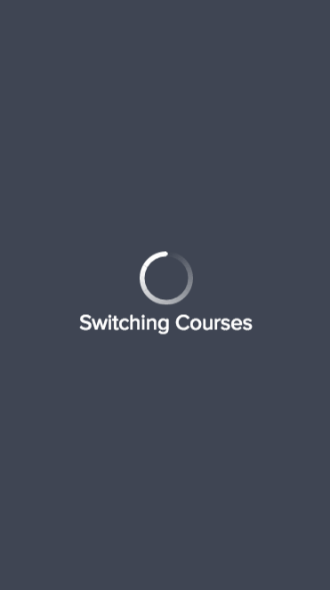
use an overlay spinner when swapping content on the screen.
-
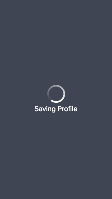
include a stacked message with an overlay spinner.
- Display a spinner on top of content above an overlay.
- Pair an overlay with the inverted white spinner and white text.
- Never use an overlay when loading additional content into / at the base of an existing layout.
Color
Loading Spinner has light and dark themes to provide contrast against a variety of background colors.
Default
Use default gray spinner on top of white $comet-background-color-default and light gray $comet-background-color-light backgrounds
Reversed
Use a white spinner on top of dark $comet-background-color-dark and product-themed background colors.
Guidelines
For loading spinners that include a message, do not exceed 30 characters.
-
use a verb + noun pairing like 'Creating Classroom…' or 'Saving Changes…'
-
use overly generic or uninformative messaging.
Class Reference
| Class | Applies to | Outcome |
|---|---|---|
|
|
|
Initializes an element to contain base spinner styles. Must be modified by size and color variation classes. |
|
|
|
Sets the size variation to large. Select a size appropriate for the space the spinner occupies. |
|
|
|
Sets the size variation to medium. Select a size appropriate for the space the spinner occupies. |
|
|
|
Sets the size variation to small. Select a size appropriate for the space the spinner occupies. |
|
|
|
Sets the color theme for a dark background. |
|
|
|
Sets the color theme for a light background. |
|
|
|
Identifies the spinner icon. |
|
|
|
Applies spinner color theming to the optional label. Defaults to the stacked variation. Use h3 in large variation only. |
|
|
|
Displays the inline label style, overriding the default stacked layout by placing the label to the right of the spinner icon. |
Macro Params Reference
| Param | Default | Values | Description |
|---|---|---|---|
|
|
|
|
Sets the color theme variation. |
|
|
|
String |
Sets the label text. Set false or leave blank for no label. |
|
|
|
|
Sets the label layout variation. Stacked messages = |
|
|
|
Sets the size variation |
|
|
|
|
Includes additional modifier classes for product-specific overrides. |